
Book Review: The Art of Dragon Age: The Veilguard
December 8th 2024
The Art of Dragon Age: The Veilguard, published by Dark Horse, is one of the strangest books I’ve picked up and you'll see why in this review. You can also check out a video review on YouTube here.
It was released less than a week after the game, which is very rare these days, as it is now the norm for video game artbooks come out 6 months to many years after a release.

This is not an art review, this is all about the book and how the content is presented to you. You can see some below or check it out online. The art from for the game has a less realistic style, closer to what you might find for an animation. But, I’ll leave it up to you if you enjoy it. I myself like most styles, including this one.
Build Quality
We are on safe ground with Dark Horse. All of their artbooks come with a hardcover, strong binding, good paper and a great print quality. You’re in good hands with these books and they are a big publisher for game artbooks in general, so there’s not much else to say!
Content
This is where the book becomes interesting to say the least and it doesn't take long to realise. For example, I can’t think of another book that doesn’t have a contents page, but that is just the start of the weird decisions here.
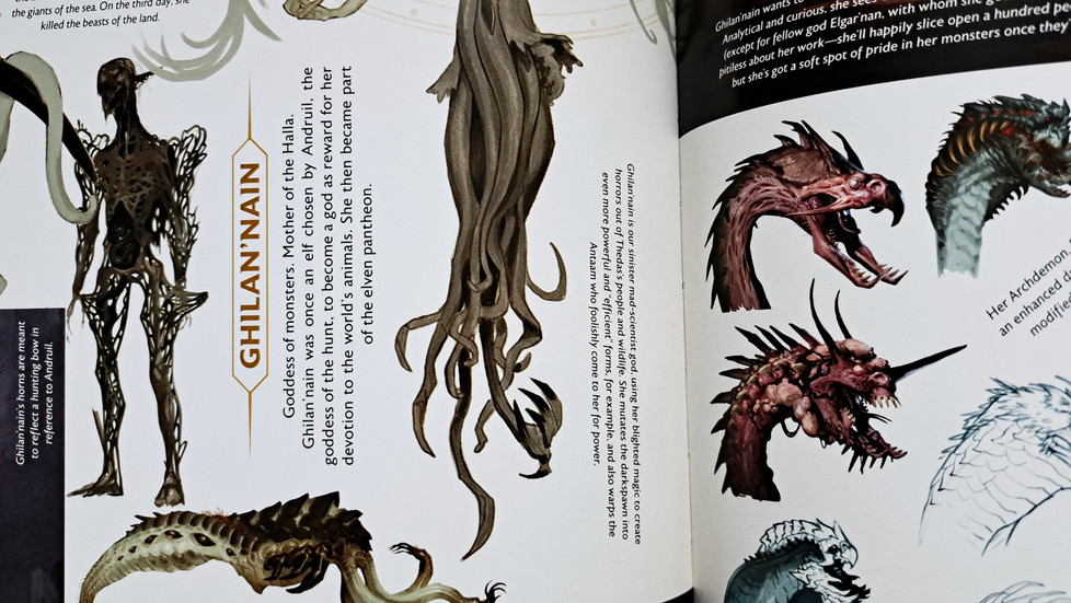
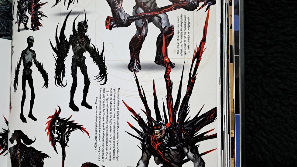
I’ll begin with how it’s presented, which is in 3 parts. Post-Inquisition up first, the earliest ideas worked on before the previous game even shipped. This is all exploration, which is great to have in any book and fans will enjoy these unused concepts. The second is Joplin, this was after Inquisition had launched and continues to showcase earlier art. Last is The Veilguard, where you see it all coming together for the final game.
There is a large amount of art here, including what they called beat boards, which are images that act as visual ideas. As well as this, you get the usual early concepts, environment art, costume exploration and more. Fans of the game have a lot to digest and will appreciate how much they share across its 256 pages. There are a some pages going over how the art style changed from Inquisition to The Veilguard, as seen below. More like this would have been nice to see as it was a highlight for me.

The text is where this book begins to completely fall apart as it feels totally scatter-brained. Some artbooks opt to include lore, some explain how the game was made and some just speak to the art. This book does all 3, but switches inconsistently between them.
It starts with explaining the ideas and early art which is normal and expected. On the beat boards it gives scenario descriptions that adds context to the images, which is fine and has some nice insights for fans. But, it then keeps switching, adding notes on the thoughts behind designs, then to lore for things like early character art. These for me don’t add anything because it feels like adding text for the sake of it. The notes are so brief, you can skip them entirely and not feel like you’re missing anything, they also aren't on every piece of art, indicating the lack of need to have them. You'll then get to more pages that switch back to the thoughts of the team and no mention of lore at all. The sporadic changes are strange, because if you can’t structure it, either be an art and lore book, or an art and behind the scenes book.
While there are moments of good insights here, a lot of the notes feel generic and aren’t interesting, at least to me. I did feel like skipping past the random bits of text after a while, which isn’t a good thing. This is made more disappointing due to the fact the game was in development for a decade, there should be a lot more of note to say.
Credits
It continues to get worse now as I move onto credits. In the foreword a bunch of praise is given to the artists and yet they failed this part of the review for me. They didn’t quite hit worse case scenario and not mention their names at all, but they didn’t do well either.
Some books only list the artists at the back of the book, sometimes the start, but at least on their own page. This book though, as seen below, puts them in the corner of a page at the start that many would flip straight past. Pages like this include the publisher and book info, so people don’t pay attention. The fact this is all they got, only to praise them a couple of pages later isn’t good.
Again, keeping consistent in their odd choices for this book, the page next to it is completely free of text. Why wouldn’t you put all their names here in larger font to pay them the respect they deserve? I wish I could say this is the strangest move by the designers, but that is next.

Use of Space
The layouts of the pages in this book are a complete disaster.
It’s as if they crammed as many pieces of art in as possible, some overlapping poorly too, and as they were ready to approve the book, someone said, "Ah wait, we forgot to add text!". Then, rather than add some more pages, they just shoved it in wherever it would fit, even sideways. In the cases of the environmental and key art, on top of images.
This wasn’t thought through, it’s messy, doesn’t read well and is again inconsistent. These books aren’t small, so when reading text placed sideways, it’s not convenient to rotate the entire book over and over again. So, it’s either spin the book, or give yourself a sore neck from cranking it constantly. Both ways too, which is where more inconsistency comes in, as they turned text clockwise and anti-clockwise, it’s bewildering.
There are so many examples of them cramming text in, on some pages, the placement works, but for the most part it’s awful. The places where they put text in the image though is even worse. Some have a bit in a bottom corner which is completely fine, but on others, the text is placed toward the centre and is very distracting. Double page spreads even put text inside the image, but there is blank space above and below the art where this could have gone. Below are examples of the poor text placements as mentioned.


To take it back to the artists, it becomes even more of a disservice, because not only are they hidden away, but some of their art has some text slapped on it. The opportunity here to their benefit, was to swap the rather dull text with their names, because if you are going to squeeze in any text, at least have it be the artist credits, it would take up less space too. If they didn’t want to credit the artists, then I think they should have removed a lot of the text entirely. There are a lot of artbooks that don’t have text at all, or only a little and as a choice and it can work. I think that would have better in this case, because it’s placed poorly and often offers very little anyway.
Ignoring the text though, the image placement isn’t great either. Things don’t need to be organised in a uniform way, but this does look like a child’s sticker book in places, not on every page, but on enough to really notice it. They tried something here, but they have missed the mark massively.
Value
I use Amazon for price checks to stay consistent, but you may find better prices elsewhere. In the UK just after release it was £30 with a discount and £45 at full price, which is the normal amount for an artbook. In the US it’s $50 at full retail price, again, nothing unusual here. This is expected for a full sized Dark Horse release, so nothing to point out here.


Verdict
As an artbook, I can’t say I’m impressed. They had 2 great ingredients, Dark Horse and a huge amount of art. The execution though is far from ideal. It’s a pain to read if you commit to doing so and if you want the 10 year background and details of this game, you won’t get that from reading it anyway.
Big fans and people after a reference book for fantasy art may find value here. As a fan of the art, it leaves less of a bad taste in my mouth because they put so much of it in. Regardless of this though, full retail price feels too high because of how messy it is, so a reduced price is the way to go if you like the art style.
For those that are interested in The Art of Dragon Age: The Veilguard, you can use the links below to purchase the book.
Tags;
Based On: #DragonAgeTheVeilguard Series: #DragonAge Publisher: #DarkHorse Studio: #BioWare #EA


Komentáře